Slack Reveals New Logo Design
Over the last few years Slack has revolutionized productivity and internal communication for the masses. In doing so, we have been accustomed to the playful hashtag and distinctive notification alerts that have slowly become the chorus to our lives. As of yesterday, if you are an avid user, you may have noticed when searching for the app or desktop icon that your favorite productivity tool received a logo face-lift. Most users would deem this as unnecessary as the previous logo "did its job". Living in the world of digital marketing and brand identity, REV77 understands the importance of consistent branding across all avenues as we ourselves are still working out the kinks for our own brand identity.
So the question is...How can something as "simple" as a logo redesign be the cornerstone to future success for a business? Slack weighed in and provided deets for their new redesign and why the time was now!
Today we’re launching a new logo, as we start to refresh our look in general. We loved our old logo, and look, and know many felt the same. And yet, here we are to explain why we decided to evolve it.
Firstly, it’s not change for the sake of change. That said, change is inevitable, and something to be embraced, etc. etc., but that’s not a good enough reason to change a logo. A good reason to change a logo is that it’s not doing the job you want it to do—and because a simpler, more distinctive evolution of it could do that job better.
Our first logo was created before the company launched. It was distinctive, and playful, and the octothorpe (or pound sign, or hash, or whatever name by which you know it) resembled the same character that you see in front of channels in our product.
It was also extremely easy to get wrong. It was 11 different colors—and if placed on any color other than white, or at the wrong angle (instead of the precisely prescribed 18º rotation), or with the colors tweaked wrong, it looked terrible. It pained us. Just look:
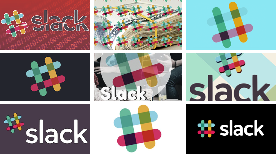
Simply awful. We developed different versions of the logo to compensate, which worked well for different purposes. But that meant that every app button looked different, and each one in turn was different from the logo.

They were all pretty good … but not at all cohesive. And the important thing about being a brand is that whenever people see you in the wild, they should recognize that it’s you. Instead, people saw this:
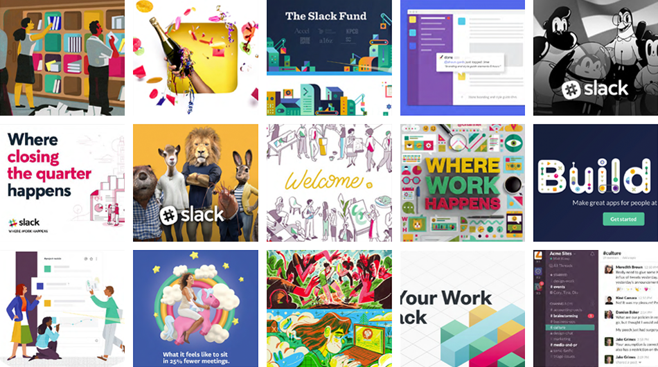
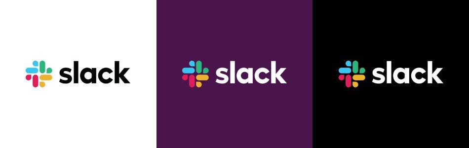
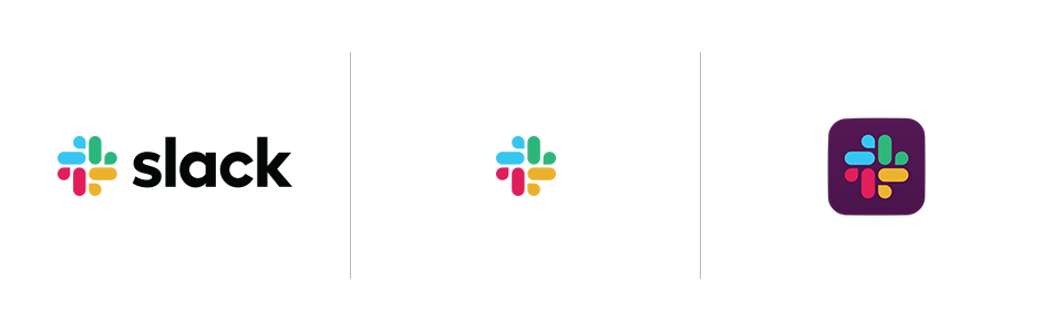
Many beautiful things—but without a sense of cohesion that you might expect. So here we are. Our in-house design and brand team, together with Michael Bierut and the team from Pentagram , worked to create a new and more cohesive visual identity. And we’re starting, today, with the logo. It uses a simpler color palette and, we believe, is more refined, but still contains the spirit of the original. It’s an evolution, and one that can scale easily, and work better, in many more places.
We’ll not bore you with the design thinking and the meaning of every angle and curve of the new logo—you’re busy people, and our main intention for this post was to let you know about the change, so you won’t be too surprised when the icons on your phone/laptop/tablet look a little different. They’ll look, in fact, reassuringly similar:
Over the next few months, you’ll see all the other visuals around Slack aligning around this new direction: on the website, in advertising, and in some places in the product (though not in a way that will keep you from the important business of getting things done, of course). It’s still us. We’re still Slack. But more consistent and, we hope, more instantly recognizable.
Original Article written by Slack Team